

The EU sees itself as a global leader in climate action. The UN Framework Convention on Climate Change (UNFCCC) was agreed in 1992. Since then, the EU has had quantitative emissions reduction targets for the period 2008-2012 under the Kyoto Protocol (a reduction of 8% compared to 1990 levels) and for the period 2013-2020 (under both the Kyoto Protocol and the 20-20-20 by 2020 Climate and Energy Package) which committed to a reduction of 20% in greenhouse gas (GHG) emissions by 2020 relative to 1990.
How have agricultural emissions trended during this period in the EU compared to other Annex 1 parties (developed countries) to the UNFCCC? The first chart below compares the trends in agricultural emissions (defined as mostly the non-CO2 gases emitted by agricultural production and soils) included in the national inventories submitted to the UNFCCC by selected Annex 1 countries.
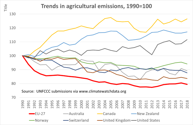
Based on this evidence, agricultural emissions in the EU-27 have fallen by more over the period since 1990 than in the other Annex 1 countries shown. The countries fall into two groups: three countries (Canada, New Zealand and US) where total emissions have grown, and Australia and the four European countries/regions where total emissions have fallen.
Much of the fall in EU-27 emissions occurred in the first few years of the period. Of the total reduction in emissions between 1990 and 2018 of 21%, there was a fall of 13% in the first three years 1990-1993 and emissions fell only by a further 8% over the period 1993-2018. As discussed in this post, the sharp reduction in emissions immediately after 1990 can be mainly attributed to the collapse in livestock numbers in Central and Eastern Europe following the end of central planning at the end of 1989. The introduction of the Nitrates Directive in 1991 may also have played a role. From 1993 onwards, the fall in agricultural emissions in the EU is very similar to the trends in the other European countries.
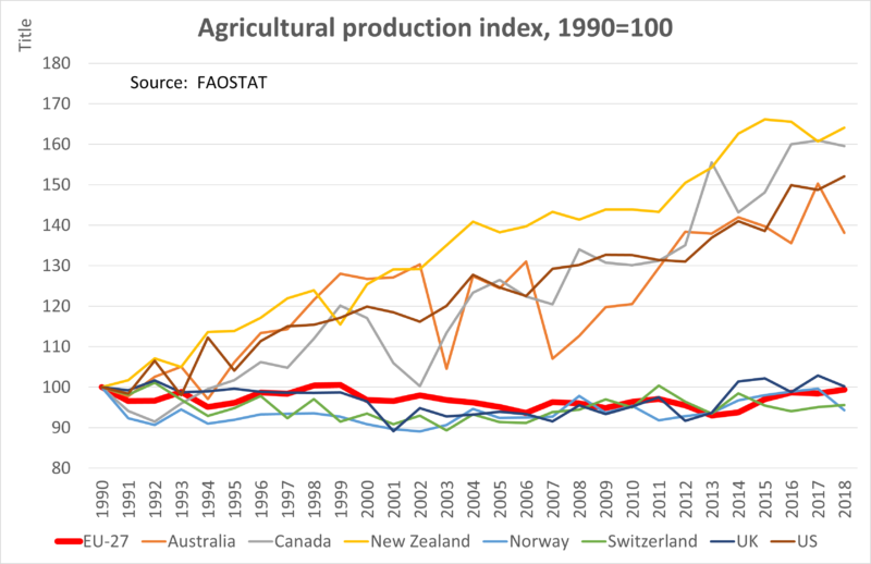
An important explanation for differences in the growth of emissions across countries is different rates of growth in agricultural output, as shown in the next chart. The European and non-European countries clearly diverge. Whereas significant growth in production has taken place in Australia, Canada, New Zealand and the US, production in the European countries/regions has been static. Other aggregate production indices will show different trends due to different methodologies (again, see this earlier post for a discussion of the FAOSTAT index). Nonetheless, the lack of growth in agricultural output in all European countries is quite striking.
The information in the previous two charts can be combined to show the trends in emissions intensities, that is, emissions per unit of output, as in the third chart below. Now the trends across countries look more similar. All countries (with the exception of Norway) show an improvement in the emissions intensity of agricultural production, although at different paces.
Indeed, one of the conclusions from the chart is the inverse correlation between the growth rate in agricultural production and the reduction rate in emissions intensity. The four non-European countries with significant growth in agricultural output also had the greatest improvements in emissions intensity, although the EU-27 matches Canada in the end year 2018. Indeed, the improvement in emissions intensity in Australia was so great that its total emissions have fallen despite significant growth in output. The EU trend again is greatly helped by the restructuring of production in the newer Member States between 1990 and 1993. In its absence, the EU performance would look much less impressive.

To summarise, the EU-27 has reduced agricultural emissions by more than the selected Annex 1 countries included in this comparison (other Annex 1 countries include Russia, Ukraine, Belarus, Turkey, Japan, and Iceland). Once we take account of the sharp drop in agricultural emissions in the first three years of the period, mainly attributable to the restructuring of agricultural production in Central and Eastern Europe following the end of central planning, its performance appears less exceptional. The absence of growth in the total volume of agricultural output since 1990 is another important contributory factor. What does not show up in the figures is any specific impact of policy interventions. However, in drawing this conclusion, we are aware that mitigating non-CO2 gases from agricultural production is technically challenging. Most mitigation efforts by farmers will be reflected in changes in net emissions/removals in the LULUCF sector, which is not the subject of this post.
This post was written by Alan Matthews
Photo credit: Colin Paterson, Yorkshire Dales via Flickr under a Creative Commons licence.
Update 18 March 2021: The statement in the original post that total emissions had grown in Australia has been corrected.

I note that EU and UK production levels have returned to where they were in the 1990s according to your second graph. So the emissions reduction would appear not to be due to a fall in productivity overall. I would be interested to hear your views on this apparent anomaly, Alan.
Also why is Australia the only country to have reduced overall emissions whilst at the same time increasing its productivity. Of all the countries in this data set it must be the one to have fared worst in terms of climate impact in the last 30 years and the one most vulnerable to environmental damage (salinization, soil erosion, wild fires etc.)
@Thanks for comment, Bill.
It emphasises the importance of keeping a clear distinction between production and productivity. You are right that the graph indicates that EU production appears not to have grown in volume terms. However, other evidence tells us that productivity (production per unit of input) has grown although at a relatively low rate. It is this growth in productivity that contributes to the fall in EU emissions intensity. If the same volume of output can be produced with fewer inputs, it also means fewer emissions.
There is likely a similar explanation for Australia. The graph shows that its production has grown strongly, but the fact that despite this its total emissions have fallen indicates that it has also experienced strong growth in productivity. It would be useful to know the sources of this productivity growth, but one likely factor is continued investment in agricultural R&D.
thank u government for this amazing information. YKC7SS7U